Shades & Papers
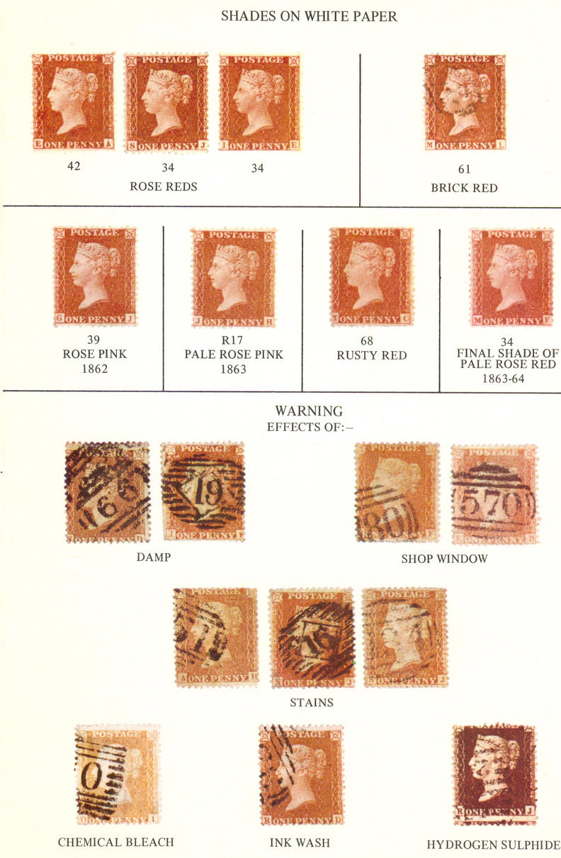
The 1d red appears in many different shades. Correct identification of these shades is helpful when plating them as there are links between some shades and the plate they were printed from and also important as some shades are scarcer than others with a corresponding variance in price. The 1d Stars are particularly complex during the "Transitional" period issues of 1856-1857 when the paper used changed from blue to yellow/cream/toned to white and many ink shades exist and the differences between them can be very hard to distinguish. As no definitive colour chart or measuring system exists at this time all that can be done is to view as many stamps as possible of the different shades and compare them with expertised items so that you become more knowledgeable about the items that you are buying and collecting. Ideally, a reference collection can be built up and constantly checked by reference to expertised items. It is very pleasing to have a range of shades to show all the different colours which the 1d red appears in and my personal view is that as long as, to quote Tonna "it is very doubtful whether two people exist who can agree on the difference between Red Orange and Orange Red", is borne in mind a lot of pleasure can be gained from collecting these issues. Do remember that you may have a copy of a 1d Star bought as orange-brown which is different to another a fellow collector has in his album. This does not mean that either is wrong. It just means that orange-brown covers a range of shades. This applies to most of the shades mentioned in Gibbons. The only problem arises when one shade becomes another as this line in the sand is hard to draw. My suggestion would be to not buy unless you are certain, or if you just like the colour and don't mind whether it's a brown-rose or a brick red. There are stamps being sold right now on the internet by so called expert dealers which are common shades described as scarce shades for premium prices and are complete rip-offs either due to dealer colour blindness or misrepresentation. In the meantime the photos below may be of some help!
The Stanley Gibbons listings do not reflect what's what with shades so, useful as the QV Specialised catalogue is, as your collection of shades expands you will not be able to fit it into the classifications listed by SG. Try visiting stamp fairs where specialist dealers sell as well as joining philatelic societies and do as much brain picking as you can. Ask experienced dealers and collectors what they think and compare notes. You will find that there is a range of views! If you really are keen to develop expertise in shades it might be worth considering a test for colour blindness as a surprisingly significant number of males have less than perfect colour perception. There are several forms of colour blindness and the most common form is red/green colour blindness, which involves the confusion of red and green. It's passed on through a faulty colour vision gene on an X chromosome as a recessive disorder. This type affects about one in ten men and has two forms. 1) Different shades of red appear dull and indistinct 2) Greens, oranges, pale reds and browns all appear as the same hue, distinguished only by their intensity. This may explain why the comment "they all look the same", all too familiar to specialists, is actually true for quite a lot of people.
There was a very interesting point made in the GBPS Newsletter of July/August 2007 which questioned the reason for the "Transitional" period as rather than being caused by the printers trying to stop the blueing of the paper in order to make sure the shades of the stamps were constant and to remove "unsightly blueing" as has generally been accepted, the real reason that bluing disappeared was because Perkins Bacon wanted to reduce the wear and tear on the printing plates by removing prussiate of potash, the chemical responsible for the blueing of the paper, from the inks used as it was known that it had corrosive properties and it was hoped that its' removal would result in reduced wear on the printing plates. If that was the case it may be that the removal of blueing was incidental to the process rather than the main reason for doing it. Maybe a bit of both? A useful amount of money would have been saved by not having to produce as many new plates if wear and tear could be reduced. Wouldn't it be marvellous to have a time machine and walk into the printers' works and to be able to ask questions for even half an hour or so! Having said all that, it is also quite possible that the blueing disappeared from the paper simply because following the fire at Perkins Bacon in 1857 the ink recipe must have been modified to some degree with all the rushing around to get production going again andd the new recipe would have been a bit different to the old. If "experiments" with the ink did lead to this change it is safe to say that the "experiments" were forced upon Perkins Bacon by necessity rather than choice after the catastrophe of the fire.
It is worth pointing out that all 1d reds of the various issues can be found on blue paper in between 1841 and 1857 after which all stamps (from C10 onward) appear on white paper only. These "blue paper" issues appear in a very wide range of shades, INCLUDING at earlier periods most of the shades which appear during the "transitional" period. This means that there is no also reason to believe that the "transitional" shades appeared as a result of "experimental" printing as they had previously appeared anyway due to the variances in the ink which would be expected bearing in mind the way the inks were prepared with a wide range of natural ingredients. It is also likely that the inks were not always prepared in an absolutely scientific way and even the mixing up them would likely have varied from day to day. The fire at Perkins Bacon on 11th March 1857 would undoubtedly have caused production problems and would have meant that some elements on production, including ink preparation, could have been rushed leading to further variances in the "normal" ink "recipe". For example, it may be reasonable to suppose that the paler rose shades appeared at that time simply because inks in short supply were diluted to eke them out that little bit further until things got back to normal?
A frequently mis-sold item which really needs looking out for are "C8a" Red Brown stamps on "White" paper. Too often these have been compared with obviously blued paper and the very faint bluing hasn't been spotted. The best way to make absolutely sure is to put the stamp on a sheet of white cartridge paper and compare it with a definitely white paper stamp as well. It's amazing the contrast you will see, (especially if you use a magnifying glass - using a fairly low power glass seems to bring out ink and paper shades that little bit more) compared to looking at the same stamp on a black background. There are a lot of Red Brown C8s on very slightly blued paper, but that isn't white! Having said that I don't think that genuinely red-brown stamps on white paper are as scarce as the catalogue makes out anyway. C8 stamps can also appear on a grey shade of paper as well as a mixture of blue and toned and blue and yellow which makes things even more interesting.
Another commonly mis-sold item is a Plum stamp. This is important as high prices are often asked. This is because people often haven't seen a genuine example it makes it difficult to spot an imposter. You will see Deep Red Brown on very blued paper, Claret on very blued paper and even very oxidised Rose Red C10s claiming to be "Plum". Sadly, even well known dealers make mistakes with paper and shades and all you can do is follow recommendations from fellow enthusiasts while the shades are being learned. I have found the dealers Andrew Chappell/QV Pennies and Bill Barrell Ltd faultless personally and would be happy to hear about any other dealers you can recommend. Do not underestimate the very significant effect that paper shades can have on the shade of a stamp. A very blued paper will make a stamp's overall shade much deeper. "Toned" paper can be hard to spot and I think the term is confusing as well as you might have a C10 with "toned paper" which in this case will mean it's a white paper stamp with paper that has gone yellowed because of age. This is a bad thing as it reduces the value of a stamp due to its' advanced ageing and reduced visual appeal. On the other hand a C9 stamp with "toned paper" is a good thing as generally the stamp will be scarcer. The trouble with that is that people will often try and sell a pale rose stamp as a C9 and it's catalogued at so much more than a C10. The thing is that it's very hard to tell the difference between the papers and some say that there isn't actually any difference of significance anyway. The C9 toned paper refers to its' creamy yellowish colour which has always been that colour but after all this time who knows, the whole "toned" thing may be a myth? The way to try and tell the difference is twofold. The C9 toned paper is usually a more delicate shade than the toning which is caused by ageing and the also the C9 toned paper stamp will never be in a rose-red shade. Some C9 type paper stamps also show some traces of blue as well (the early transitional period). The line between C8 and C9, if there has to be one, can only be drawn by saying that any stamp with even slight blueing must be a C8 stamp. Having said that, the elimination of blueing did not take place overnight and there are stamps with every combination of grey/toned/yellowed/blued paper can be found in what is known as the first transitional condition. C9 stamps should be completely free of blueing simply appearing on the toned yellowish or cream colour paper. I believe that some of these C9 stamps have the potential to blue given the right environmental conditions and unblued may be a good term to use to describe them. It is easier to identify the C9 and C10 stamps by their shades rather than by their paper types. Any stamp that is a shade of rose red must be a C10. If the paper of a rose red stamp looks "toned" it's because it's yellowed with age or has been stained by gum. "Toned" paper doesn't make a C9 but any rose red shade does make a C10. Any orange shade on unblued paper must be a C9. The pale rose and pale red shades could be either a C9 or C10 and individual stamp's paper can often not be definitely determined as toned in terms of being the true creamy C9 paper rather than the aged C10 paper. Lots of "C9s" for sale in the pale rose and pale red shades could just as easily be C10s but have been listed as C9s as the higher catalogue value means they generally realise a higher price. In short, be very wary about paying a premium for "C9s" in pale rose shades especially as so many sold us such are just pale shades of rose red on discoloured white paper anyway. One of the most confusing, and pointless, Stanley Gibbons classifications are the SG40 C10(2) - pale red & C10(3) - pale rose entries which are in practice the same stamps as C9(3) - pale red & C9(4) - pale rose. maybe ditching C10(2) - pale red & C10(3) - pale rose entries from the catalogue would be sensible?
The thickness of the paper varies a lot as would be expected with a material that is largely handmade. Philbrick and Westoby comment that "This is especially noticeable on some of the one penny stamps, particularly those printed around the Summer of 1870 (plates 139-144) which are on comparatively thick paper, differing materially from those appearing in the Autumn of 1876 which are found on paper so thin as to almost resemble pelure paper." I don't think that too much can be deduced from paper thickness in terms of issue though - it's possible to find thinner and thicker papers used on most plates.
Some example shades
The 6 stamps below are -
Top left - RED BROWN WITH A HINT OF CLARET
Top centre - ROSE RED
Top right - ORANGE RED
Bottom left - RED BROWN
Bottom centre - PALE RED (a deep shade of pale red)
Bottom right - ORANGE BROWN (an unusually orange shade)

Bright Rose Red is a scarce shade only found on SG40 C10 (1). 1d red CJ below is bright rose red C10(1), GD is deep rose red C10(4), OB is rose red C10(5) and FK is pale rose C10(3)
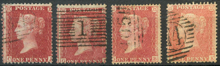
But, before shades confuse you too much, remember that these stamps were printed in huge volumes and the ink and paper and the stamps' environment over the course of time will not all have been the same, even if the ink "recipe" was supposed to be. Have a look at these Penny Plates (4 corner letters) which are only listed as rose red or lake red in the catalogue but have a look at some natural variances which occur! Discussions on shades are nothing new. In the May 1st edition of Stamp Collecting "A Newport reader" asks "Why, even with the plate number series, is there such a difference in shade? They vary from almost black to a pale orange". The response from "Britannicus" is that sulphur in the atmosphere has reacted with the red pigments cauring the to darken. This is an accurate response to explain very dark sulphuretted/oxidised stamps but it doesn't explain the pale shades. As always the simplest explanation is often the best and that is that the printers mixed thousands and thousands of gallons of ink and didn't always measure the mixture perfectly accurately leading to variations in shades. This would then be compounded by variations in how much ink would be put on the plate before printing, how much was wiped off the plate before printing, the temperature of the printing plate itself, how damp the paper was before inking, whether the water used for dampening the paper was contaminated in any way (it invariably would have been) plus a good dose of human error thrown in then a period of between 130 and 160 odd years worth of environmental factors thrown in to age things nicely. In short, when you find a nice bright rose red shade on white paper it's really quite amazing that it's survived in such nice condition considering that these stamps were disposable items. Having said that, we'll never be absolutely sure what the stamps looked like originally except that it's fair to say that the shades were brighter and the paper whiter.

Some orange shades
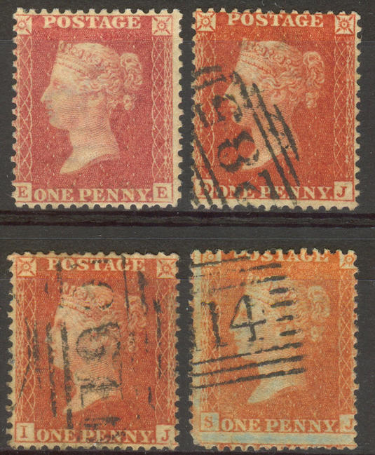
EE is rose red, DJ red-orange, IJ orange red and SJ orange.
Some shade related articles -
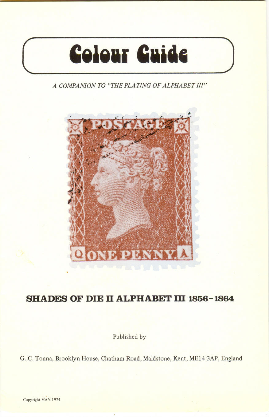
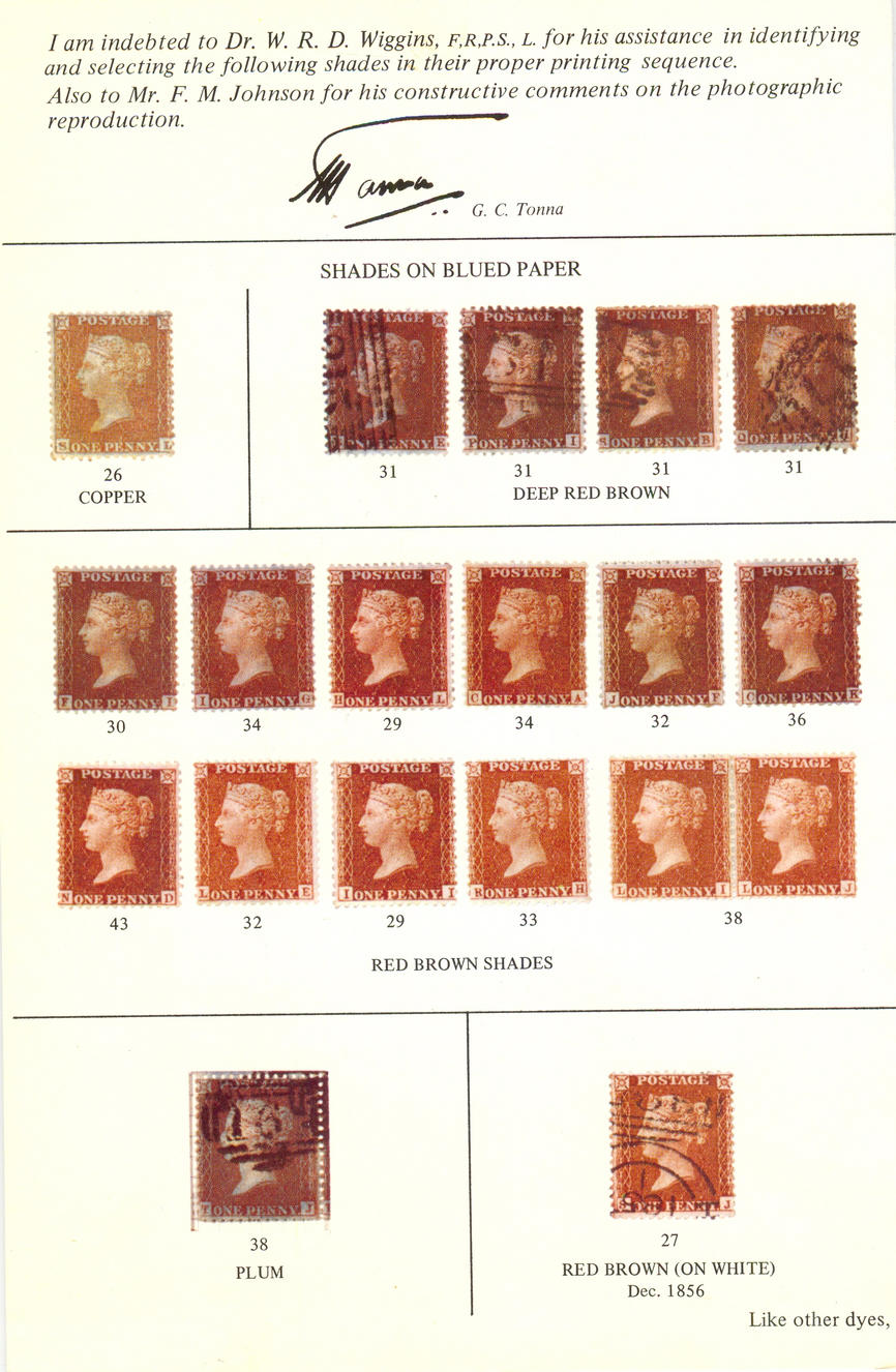
The Tonna Colour Guide
It's not great as the shade reproduction is nowhere near good enough for one thing, but it's worth looking at just for the retro Seventies font!


|